Writing Content
Pages are plain Markdown files under src/ (VitePress's srcDir). This page covers what you can put in them: the page types the theme recognizes, the Markdown syntax it adds on top of VitePress, and how to drop Vue components into a page.
The demo page src/markdown-examples.md shows every feature below as input beside output — keep it open in the dev server while you read this.
Field-by-field frontmatter types and defaults live in configuration/frontmatter.md.
Page types
The theme classifies every page from its location and renders a dedicated layout for it. You never wire this up — you just put the file in the right place:
| Put the file at | It becomes | You get |
|---|---|---|
src/index.md with home: true | home | The welcome card from themeConfig.home |
src/<anything>.md | normal | Plain article chrome — title, content, footer |
src/posts/<post>.md | post | Byline, taxonomy, cover, license and comment cards |
src/series/<slug>/<part>.md | series article | The same, under a series banner |
src/posts.md, archives.md, categories.md, tags.md, series.md | listing | Whatever listing component you place in it |
| — | not-found | The 404 page, client-rendered |
Two frontmatter escape hatches exist for the rare case where the path lies: pageType forces a type outright, and article: false drops a post to a plain page. The reasoning behind the layout is in design/content-architecture.md.
Frontmatter you'll use constantly
---
title: Hello, Terminal          # or a per-language map
description: A first look.      # summary in listings + meta description
date: 2026-07-28                # posts: publish date and listing order
tags: [theme, color]            # posts: taxonomy (plain names)
categories: Guides
cover: /images/hello.svg        # posts: card panel + article hero
order: -1                       # explorer/series ordering, smaller sorts higher
showInExplorer: false           # hide from the tree (still reachable by URL)
---
Standard Markdown
Headings, paragraphs, emphasis, blockquotes, lists, rules, links, tables, images, and inline code are all styled to the design language across the three color modes. Two behaviors worth knowing:
- Heading anchors. Every heading gets a
#control that appears on hover (always visible on touch). Clicking it copies that heading's absolute URL and confirms with a transient toast. - Reading measure. Body text is capped at a comfortable measure and stays neutral — the main color is reserved for emphasis (links, bold, headings, inline code). This is a binding rule, not a preference:
design/color-system.md.
Code blocks
Fenced blocks are highlighted by Shiki with the Oxocarbon palettes and follow the active color mode. Each renders as a card with a title bar carrying the language and a [copy] control:
```js
export default { name: 'VitePressThemeTerminal' }
```
Add a file name in square brackets after the language and it appears in the title bar before the language:
```scss [main.scss]
body { color: var(--ct-main); }
```
Callouts
Eight container types, each with a colored left bar and an icon:
::: tip
Everything after the type is the body.
:::

::: warning Custom title
The rest of the line becomes the title.
:::

::: details
Collapsible — click the title to expand.
:::| Type | Notes |
|---|---|
info / note | note is a style alias with its own title |
tip | |
warning | |
danger / caution | caution is a style alias with its own title |
important | |
details | Collapsible, with an animated chevron |
Default titles are localized automatically; a custom title (anything after the type on the opening line) is used verbatim and may contain inline Markdown.
Pull quotes
For a line worth setting apart, the quote container frames it with corner marks in the shape of the Chinese brackets 「 and 」, drawn in the main color — opener at the upper-left, closer at the lower-right:
::: quote
Hello, World!
:::
The container takes any Markdown, so a longer quotation and its attribution fit too. Nothing is configurable: the marks are drawn by the theme (with borders — they are not text, so they need no CJK font and never end up in a copied selection), the quotation is set bold, and the frame shrink-wraps it and centers in the column — a short line keeps the marks right beside it, a long one fills the column as usual.
Use the plain > blockquote for a quotation in the flow of your text, and ::: quote when the quotation is the point.
Markdown extensions
Enabled site-wide, no configuration needed:
| Feature | Syntax |
|---|---|
| Emoji | :tada: |
| Subscript | H~2~O |
| Superscript | 29^th^ |
| Inserted text | ++inserted++ |
| Marked text | ==highlighted== |
| Footnotes | Text[^1] … [^1]: The note. |
| Definition lists | Term / : definition |
| Abbreviations | *[HTML]: HyperText Markup Language |
Math
Two renderers, both typeset in IBM Plex Math, with no collision between them.
LaTeX uses the familiar delimiters and is rendered at build time to MathML:
Inline $E = mc^2$ and a display block:

$$
\frac{1}{2} \sum_{i=1}^{n} x_i
$$
Typst uses its own container and inline form:
::: typst
1/2 < floor("mod"(floor(y/17) dot 2^(-17 floor(x)), 2))
:::

Inline: :typst[e^(i pi) + 1 = 0]
Typst is compiled in the browser. Malformed input shows a visible error beside the kept source rather than a blank space, and with JavaScript off the raw source stays readable. The $ delimiters always mean LaTeX — $$…$$ never routes to Typst.
Images and galleries
Every image in the content area joins one click-to-enlarge gallery automatically. An image wrapped in a link keeps its link instead, and a single image opts out with data-no-lightbox:
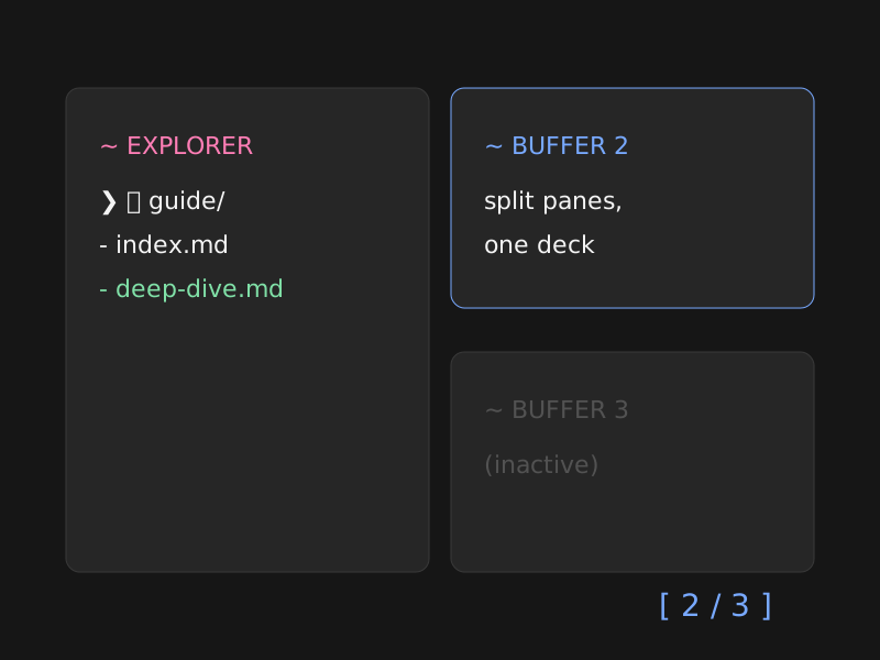
<img src="/images/logo.svg" alt="Logo" data-no-lightbox>For a swipeable deck, nest slide containers inside a swiper container — note the outer fence needs more colons than the inner ones:
:::: swiper
::: swiper-slide-no-shadow

:::
::: swiper-slide-no-shadow
:::
::::Decks get prev/next chevrons outside the images and support mouse and touch swipes.
Per-language page bodies
A page can carry several language versions of its body; the reader's language switch swaps them in place, with no URL change:
::: lang en
English body…
:::

::: lang zh-Hans
中文正文…
:::
Content outside any ::: lang block always shows, so shared code samples and images need not be duplicated. Details in internationalization.md.
Vue components in Markdown
VitePress lets any page use Vue. The theme adds an @ alias pointing at .vitepress/theme, so imports stay short:
<script setup lang="ts">
import Card from '@/components/Card.vue'
</script>

<Card
  :show-prompt="true"
  :prompt="{ command: 'card', args: '~/notes' }"
>
  <p>Any content can live in a card.</p>
</Card>
Card is the theme's reusable floating window. Its prompt object takes a required command plus optional host, path, and args; omitted values default to the configured site name (or the normalized site title) and the current page path. The prompt is off unless show-prompt is set.
The listing components (PostsIndex, ArchivesList, CategoriesIndex, TagsIndex, TermPosts, SeriesIndex, SeriesArticles) and FriendLinks are registered globally — place them without importing. For pages that are mostly components rather than prose, author a view instead: customization.md.
撰写内容
页面就是 src/(VitePress 的 srcDir)下的普通 Markdown 文件。本页讲的是你可以 往里面写什么:主题能识别的页面类型、它在 VitePress 之上追加的 Markdown 语法,以及 如何把 Vue 组件放进页面。
演示页面 src/markdown-examples.md 把下面每一项功能都以源码与渲染结果并列的方式 展示了一遍——读本页时不妨在开发服务器里同时打开它。
逐字段的 frontmatter 类型与默认值见 configuration/frontmatter.md。
页面类型
主题会根据页面所在位置为它归类,并渲染对应的布局。你不需要做任何接线,只要把文件 放对地方:
| 把文件放在 | 它就成为 | 你会得到 |
|---|---|---|
src/index.md 且带 home: true | 首页 | 由 themeConfig.home 驱动的欢迎卡片 |
src/<任意>.md | 普通页面 | 基础的文章外观——标题、正文、页脚 |
src/posts/<post>.md | 文章 | 署名行、分类法、封面、许可与评论卡片 |
src/series/<slug>/<part>.md | 系列文章 | 同上,外加系列横幅 |
src/posts.md、archives.md、categories.md、tags.md、series.md | 列表页 | 你在其中放置的列表组件 |
| —— | 404 | 未找到页面,客户端渲染 |
只有在路径「说谎」的少数情况下才需要两个 frontmatter 应急开关:pageType 直接 强制指定类型,article: false 则把一篇文章降级为普通页面。这套布局背后的思路见 design/content-architecture.md。
你会经常用到的 frontmatter
---
title: 你好,终端            # 也可以写成分语言的映射
description: 初次一瞥。       # 列表中的摘要 + meta description
date: 2026-07-28            # 文章:发布日期与列表排序
tags: [theme, color]        # 文章:分类法(写原始名称)
categories: Guides
cover: /images/hello.svg    # 文章:卡片面板 + 文章头图
order: -1                   # 文件浏览器/系列排序,数值越小越靠前
showInExplorer: false       # 从目录树中隐藏(URL 仍可访问)
---
标准 Markdown
标题、段落、强调、引用、列表、分隔线、链接、表格、图片与行内代码,都已按设计语言在 三种配色模式下完成样式设计。有两点行为值得知道:
- 标题锚点。 每个标题都有一个
#控件,悬停时出现(触屏上始终可见)。点击它会 复制该标题的绝对 URL,并弹出短暂的提示条确认。 - 阅读行宽。 正文宽度被限制在舒适的行宽内,并保持中性色——主色留给强调元素 (链接、粗体、标题、行内代码)。这是硬性规则,而非偏好:
design/color-system.md。
代码块
围栏代码块由 Shiki 使用 Oxocarbon 配色高亮,并跟随当前配色模式。每个代码块渲染为 一张卡片,标题栏中显示语言并带有 [copy] 控件:
```js
export default { name: 'VitePressThemeTerminal' }
```
在语言之后用方括号写上文件名,它就会出现在标题栏中语言的前面:
```scss [main.scss]
body { color: var(--ct-main); }
```
提示框(Callouts)
共八种容器类型,每种都有一条彩色左侧竖条和一个图标:
::: tip
类型之后的所有内容都是正文。
:::

::: warning 自定义标题
开头那一行的其余部分会成为标题。
:::

::: details
可折叠——点击标题展开。
:::| 类型 | 说明 |
|---|---|
info / note | note 是样式别名,但有自己的标题 |
tip | |
warning | |
danger / caution | caution 是样式别名,但有自己的标题 |
important | |
details | 可折叠,带展开/收起的箭头动画 |
默认标题会自动本地化;自定义标题(开头那一行中类型之后的内容)原样使用,并且可以 包含行内 Markdown。
引言块(Pull quotes)
想让某句话单独成景时,可以使用 quote 容器:它会用主色绘制形如中文引号 「 与 」 的角标把内容框起来——左上角是前引号,右下角是后引号:
::: quote
Hello, World!
:::
容器内可以写任意 Markdown,因此较长的引文连同出处也放得下。这里没有任何可配置 项:角标由主题用边框绘制(并非文字,因此无需 CJK 字体,也不会被复制进选区), 引文本身加粗,引用框会自动收紧到引文宽度并在正文列中居中——短句的角标会紧贴其 两侧,较长的引文则照常占满整列。
行文之中的引用请继续使用普通的 > 引用块;当引文本身就是重点时,才用 ::: quote。
Markdown 扩展
全站默认启用,无需任何配置:
| 功能 | 语法 |
|---|---|
| Emoji | :tada: |
| 下标 | H~2~O |
| 上标 | 29^th^ |
| 插入文本 | ++inserted++ |
| 高亮文本 | ==highlighted== |
| 脚注 | Text[^1] …… [^1]: 注释内容。 |
| 定义列表 | 术语 / : 定义 |
| 缩写 | *[HTML]: HyperText Markup Language |
数学公式
两套渲染器,都使用 IBM Plex Math 排版,且彼此不会冲突。
LaTeX 使用大家熟悉的定界符,并在构建时渲染为 MathML:
行内公式 $E = mc^2$,以及一个独立公式块:

$$
\frac{1}{2} \sum_{i=1}^{n} x_i
$$
Typst 有自己的容器与行内写法:
::: typst
1/2 < floor("mod"(floor(y/17) dot 2^(-17 floor(x)), 2))
:::

行内::typst[e^(i pi) + 1 = 0]
Typst 在浏览器中编译。输入有误时会显示可见的错误信息并保留源码,而不是留下一片 空白;在关闭 JavaScript 的情况下,原始源码依然可读。$ 定界符永远表示 LaTeX ——$$…$$ 绝不会被路由到 Typst。
图片与相册
内容区域中的每张图片都会自动加入同一个点击放大的相册。被链接包裹的图片保留其链接, 单张图片可以用 data-no-lightbox 退出:

<img src="/images/logo.svg" alt="Logo" data-no-lightbox>若要做成可滑动的卡片组,把幻灯片容器嵌套在 swiper 容器内——注意外层围栏需要 更多的冒号:
:::: swiper
::: swiper-slide-no-shadow

:::
::: swiper-slide-no-shadow

:::
::::卡片组的前进/后退箭头位于图片之外,并支持鼠标与触屏滑动。
分语言的页面正文
一个页面可以承载多种语言的正文;读者切换语言时会就地替换,URL 不变:
::: lang en
English body…
:::

::: lang zh-Hans
中文正文……
:::位于任何语言块之外的内容始终显示,因此共用的代码示例与图片无需重复。详见 internationalization.md。
在 Markdown 中使用 Vue
VitePress 允许任何页面使用 Vue。主题额外提供了指向 .vitepress/theme 的 @ 别名, 让 import 更简短:
<script setup lang="ts">
import Card from '@/components/Card.vue'
</script>

<Card
  :show-prompt="true"
  :prompt="{ command: 'card', args: '~/notes' }"
>
  <p>卡片中可以放任何内容。</p>
</Card>
Card 是主题可复用的浮动窗口组件。它的 prompt 对象需要一个 command,另有可选 的 host、path 与 args;省略的值默认取配置的站点名(未配置时取规范化后的站点 标题)与当前页面路径。除非设置 show-prompt,否则提示符不显示。
列表组件(PostsIndex、ArchivesList、CategoriesIndex、TagsIndex、 TermPosts、SeriesIndex、SeriesArticles)以及 FriendLinks 都已全局注册—— 直接使用,无需 import。如果某个页面主要由组件而非文字构成,请改为撰写一个 视图:见 customization.md。